New Look. Same Vision.
For 70 years, the ABC logo has stood as a symbol of excellence in the orthotic & prosthetic profession—a mark of merit for all who achieve the highest standard for certification or accreditation.
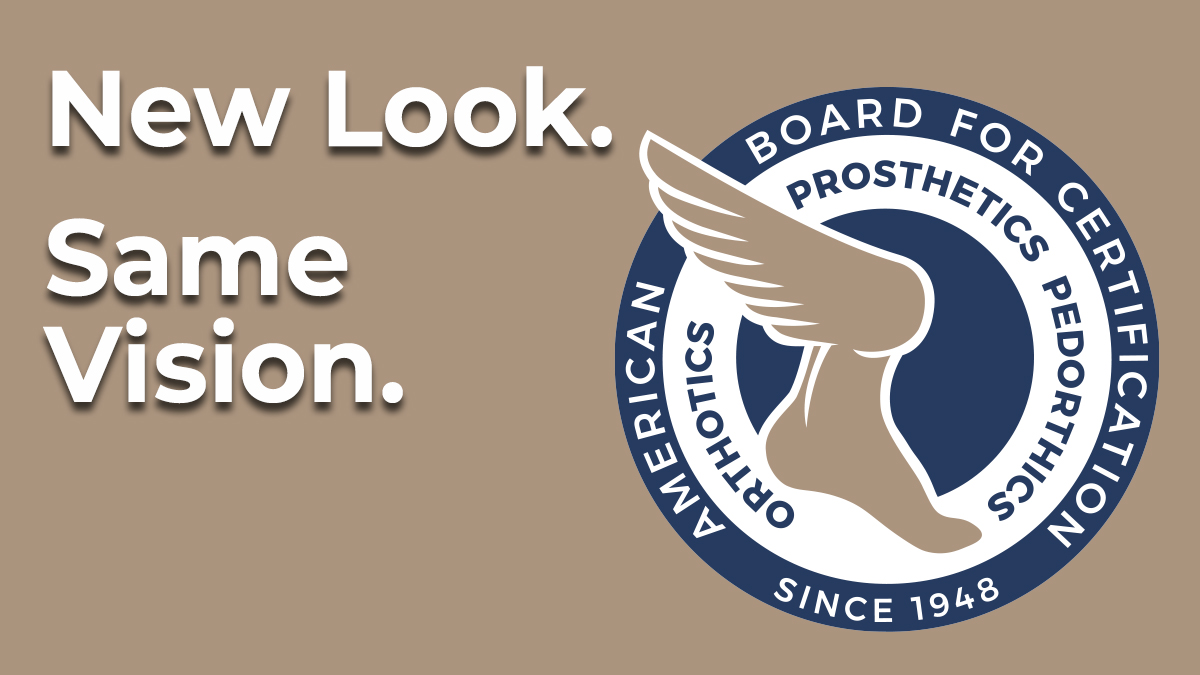
ABC and the profession have both evolved. No longer do practitioners use pulling tools to design and create a prosthesis nor does ABC administer a paper and pencil exam. The board of directors wanted to reflect this evolution in an updated and modernized logo for ABC.
What you see is a fresh new look that still keeps the feel and familiarity of the original logo with a more contemporary design.
The board was heavily involved in the entire redesign process and feel that the new logo aptly represents ABC’s credentialed individuals and facilities.
The decision to change the colors was deliberate. While the red and black are certainly recognizable in the profession, the board felt it was time to move to a more meaningful and versatile color palette. The blue and taupe convey a sense of trust, dependability, strength, warmth and excellence—all qualities that embody the work we do and the people and facilities we serve.
We like to think of it as a New Look but with the Same Vision of:
Setting Standards
Improving Outcomes
Changing Lives
"Our look may have changed, but our focus on Setting Standards, Improving Outcomes and Changing Lives has not."
Larry Word, CPO, FAAOP President
Subscribe to ABC CredCast
 Listen on Apple Podcasts (opens in a new tab)
 Listen on Google Podcasts (opens in a new tab)


American Board for Certification in Orthotics, Prosthetics & Pedorthics
330 John Carlyle Street, Suite 210, Alexandria, Virginia 22314
Phone: (703) 836-7114 | Fax: (703) 836-0838 | Email: info@abcop.org
©2019 American Board for Certification in Orthotics, Prosthetics & Pedorthics. All Rights Reserved.
Web Design and Development by Matrix Group International, Inc.
![]()